

8.2. Visualisation of temperature during extreme weather events with Climate Pulse#
Production date: 2025-06-30 (updated 2026-01-09).
Application version: 1.0.
Produced by: Nicole Reynolds, Olivier Burggraaff (National Physical Laboratory).
🌍 Use case: Visualising extreme temperature events#
❓ Quality assessment question#
Is the Climate Pulse application an appropriate tool for broad audiences to visualise temperature data relating to extreme weather and climate events, including El Niño & La Niña, heatwaves, and volcanic eruptions?
Extreme weather events – such as El Niño & La Niña, heatwaves, and volcanic eruptions – can have widespread impacts on human health, society, and the economy [Bell+18]. The frequency and intensity of extreme weather events are increasing under climate change [Kundzewicz+16], making timely and accurate communication of these events and their impacts more critical than ever.
The Climate Pulse (Pulse) application provides near real-time visualisations of global surface air and sea surface temperature, along with an archive of past daily, monthly, and annual maps derived from the global ERA5 climate reanalysis dataset [Hersbach+20]. Pulse is designed to help a broad audience clearly and effectively communicate global temperatures.
This assessment examines the suitability of the Pulse application for visualising the temperature effects of extreme weather events.
📢 Quality assessment statement#
These are the key outcomes of this assessment
The Pulse application:
Is suitable for visualising current and historical (from 1979) El Niño and La Niña events. The monthly maps are at a suitable spatial and temporal scale for the visualisation of global surface air and sea surface temperature anomalies. The global average temperature anomaly time series allows for long-term comparison and inspection of the impacts of ENSO events.
Is suitable for visualising heatwaves from January 2023. This is due to the availability of daily surface air temperature anomaly maps, which can be zoomed in on affected regions, thereby ensuring both spatial and temporal suitability. Prior to 2023, only monthly maps are available, which lack the temporal resolution needed to capture these typically short-term events.
Is not suitable for visualising the temperature impacts of volcanic eruptions due to it only displaying near-surface (2 m) air temperature data that do not capture the stratospheric effects of these events, along with its use of a 1991–2020 baseline, which makes cooling from historical eruptions like Pinatubo less visible.
📋 Methodology#
Pulse is an interactive application designed for a broad audience to visualise global surface air temperature (at 2 m above the surface) and sea surface temperature (at 10 m below the surface). It displays daily, monthly, and annual maps along with a global average time series, shown in Figure 8.2.1. These are based on near real-time data (typical delay of about two days) from the ERA5 climate reanalysis dataset [Hersbach+20], including preliminary data from ERA5T, regridded onto a regular 0.25° \(\times\) 0.25° grid, approximately 30 km \(\times\) 30 km. Table 8.2.1 outlines the temporal availability of surface air temperature and sea surface temperature data.
Pulse displays both absolute temperature values and anomalies. The anomalies are calculated as the difference between the current temperature and the 1991–2020 average, the standard reference period used by the World Meteorological Organization (WMO). For daily anomalies, this baseline is smoothed with a low-pass filter to remove short-term variability.
Surface Air Temperature |
Sea Surface Temperature |
|
|---|---|---|
Time Series |
1 January 1940 |
1 January 1979 |
Daily Map |
1 January 2023 |
1 January 2023 |
Monthly Map |
January 1979 |
January 1979 |
Annual Map |
1979 |
1979 |
Outputs from Pulse can be exported in three ways:
Data download
Time series and global image export (Figure 8.2.1)
Screenshot of the dashboard (Figure 8.2.2)
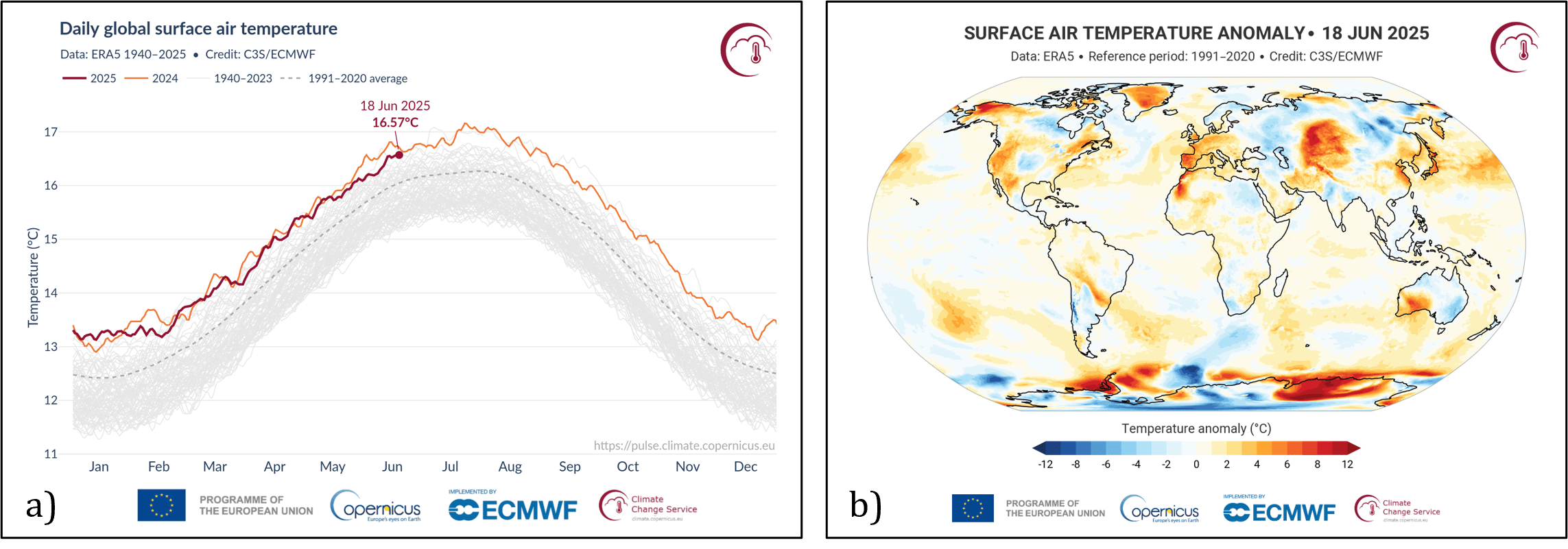
Fig. 8.2.1 Example image exports from Pulse. a) Time series of daily global surface air temperature average from 1940, b) Daily map of surface air temperature anomaly (7 January 2026).#
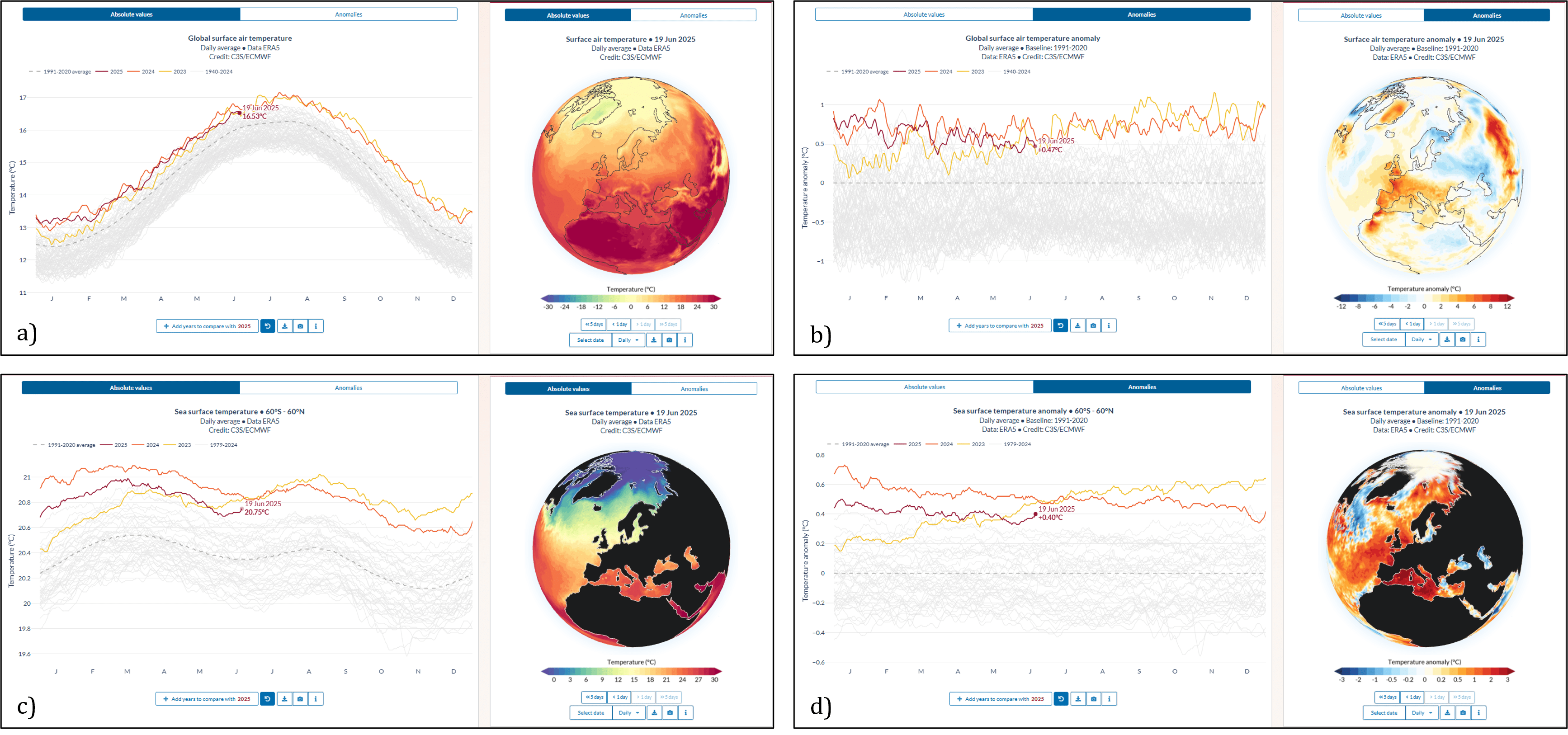
Fig. 8.2.2 Screenshots of the Pulse dashboard. a) Air temperature absolute values, b) Air temperature anomalies, c) Sea temperature absolute values, d) Sea temperature anomalies.#
Applications are quality assessed separately from their underpinning datasets. For information on quality attributes of the underlying datasets, the reader is referred to the quality assessment of the datasets, which can be found in their respective CDS catalogue entries or on the EQC hub.
The analysis and results are organised in the following use cases, which are detailed in the sections below:
📈 Analysis and results#
This quality assessment evaluates the suitability of Pulse for visualising extreme weather events for use by broad audiences. Three types of events were selected as test cases: El Niño & La Niña, heatwaves, and volcanic eruptions. Pulse was assessed based on the availability of relevant data variables, granularity of the data, spatial and temporal coverage and resolution, and the timeliness of data updates. The assessment is illustrated with practical examples of how these extreme weather events appear in Pulse in real-world scenarios.
1. El Niño–Southern Oscillation (ENSO)#
Introduction#
El Niño (warm phase) and La Niña (cold phase) are opposite phases of the ENSO (El Niño–Southern Oscillation), a recurring climate phenomenon in the equatorial Pacific Ocean. They typically recur every 2 to 7 years and last 9 to 12 months [NOAA+24, Wang+16, McPhaden+06]. ENSO events are declared when regions in the central and eastern equatorial Pacific, so-called Niño regions, meet certain temperature anomaly thresholds. Commonly used thresholds are \(+\)0.5 °C for an El Niño and \(-\)0.5 °C for a La Niña event, observed for 3 months in a 5-month consecutive period [Shen+23, McPhaden+06, Philander+85].
The ENSO has widespread effects on global weather patterns (Figure 8.2.3). Warming due to El Niño, along with ongoing climate change, has led recent events to break many temperature records. The 2023–2024 El Niño event was widely reported in the media as driving nine straight months of record-breaking high temperatures [AFP+24, Rowlatt+23]. The media also focused on the severely negative impact of this event on human health, such as higher temperatures causing the spread of malaria into traditionally cooler regions of East Africa, and on the negative economic impacts historically associated with El Niño [Mefo Newuh+24, Gerretsen+23]. The 2020–2021 La Niña prompted the media to publish warnings of increased flood risk and increased storm power and frequency in North America; however, some outlets focused on potential positive impacts, such as a reduction in Australia’s summer bushfires [Johnson+20, McGrath+20].
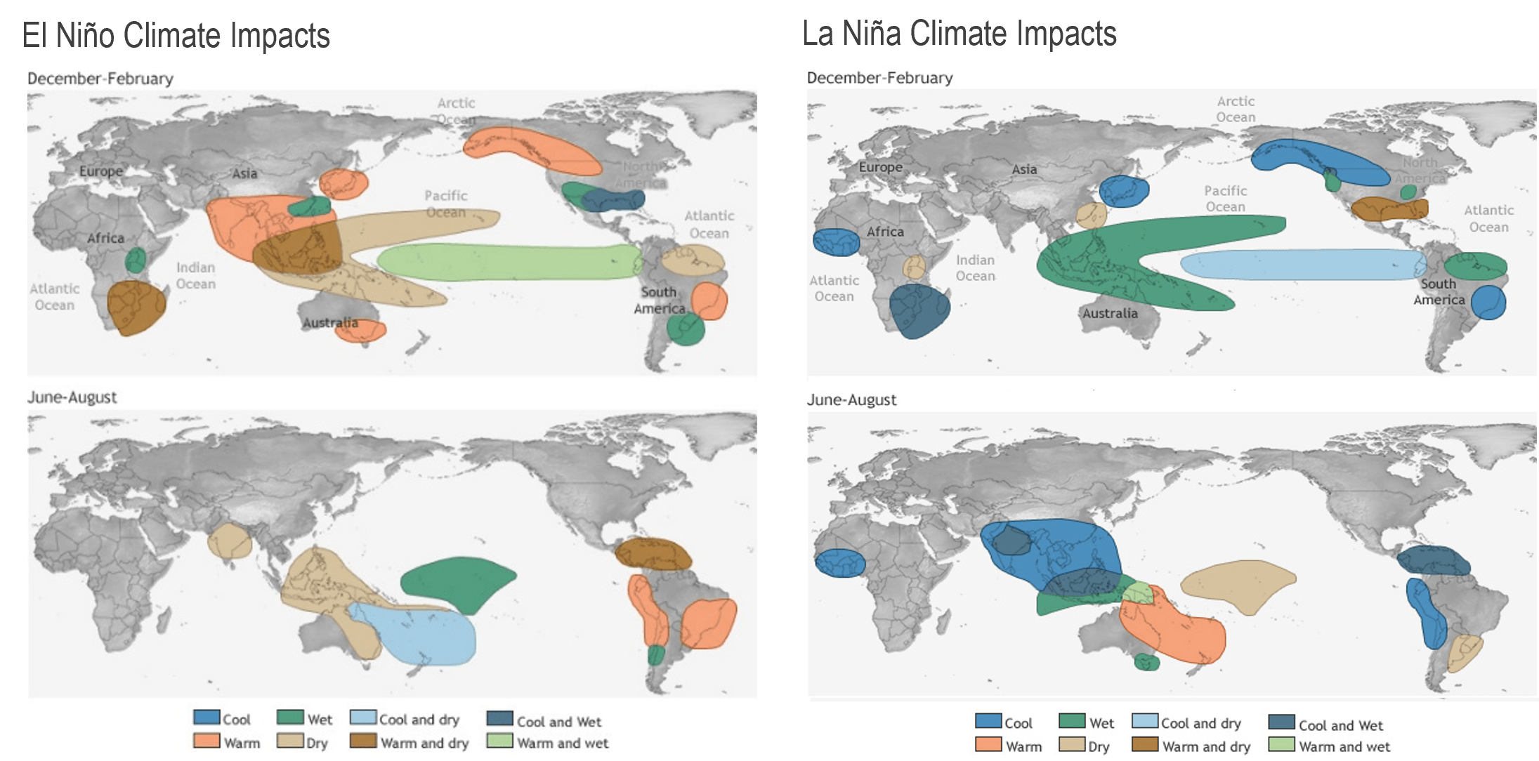
Fig. 8.2.3 Global distribution of climate impacts of El Niño and La Niña. Source: NOAA (National Oceanic and Atmospheric Administration). Available at: https://www.climate.gov/news-features/featured-images/global-impacts-el-niño-and-la-niña#
Assessment of Pulse#
Pulse is determined to be suitable for visualising the temperature impacts of El Niño and La Niña events for the following reasons:
Variables: Pulse allows for the visualisation of temperature anomalies against WMO’s standard reference period, which is a key indicator of ENSO events. Pulse is suitable for visualising both increases (El Niño) and decreases (La Niña) in temperature anomalies.
Data Granularity: Pulse’s monthly maps show anomalies on a scale from \(-\)7 °C to \(+\)7 °C, in increments of 0.5 to 1 °C (nonlinear colour scale) for surface air temperature and \(-\)3 °C to \(+\)3 °C, in increments of 0.1 to 0.5 °C for sea surface temperature. This scale is fine and wide enough to display the effects of ENSO events.
Spatial Coverage and Resolution: The spatial coverage (global) and resolution (0.25° \(\times\) 0.25°) of the temperature anomaly maps are appropriate for visualising the effects of the ENSO on air and sea temperatures, notably including the central and eastern Pacific regions where ENSO patterns are most pronounced.
Temporal Coverage and Resolution: Pulse shows near real-time and historical temperature data at daily, monthly, and annual time scales. For ENSO events, which typically develop and persist over several months, the monthly data are particularly suitable. The availability of monthly data from January 1979 allows users to look back at previous events, supporting comparisons across multiple ENSO cycles, and helping to contextualise current events within long-term trends.
Timeliness: Pulse is typically updated with data for the latest month within three days, making it well-suited for timely reporting on current events and climate monitoring.
Uncertainty: Pulse does not show uncertainty estimates in the time series or maps. Uncertainties in ERA5 temperatures are generally on the order of 0.5 °C. This is suitable for the use case of visualising ENSO events, which cause significantly larger temperature anomalies.
Example: 2023–2024 El Niño event and 2020–2021 La Niña event#
The 2023–2024 El Niño event was officially declared by WMO on 4 July 2023 and dissipated in April 2024 [WMO+24, WMO+23]. The 2020–2021 La Niña event emerged in August 2020 and dissipated in May 2021 [Li+22]. Figures 8.2.4 and 8.2.5 show global surface air and sea surface temperature anomalies during these periods, along with a typical year without ENSO activity, visualised using Pulse. The similarities with Figure 8.2.3 are evident, particularly the warming (El Niño) and cooling (La Niña) over and in the central and eastern Pacific, and broader global temperature increases.
Pulse is shown to visualise ENSO events effectively by clearly depicting the associated temperature patterns. Some variations from the expected patterns exist, but these are characteristic of the event.
Figure 8.2.6 shows the global temperatures for both surface air and sea surface as clearly higher for the El Niño period. The general increase in global temperatures relative to the baseline period (1991–2020) may cause the amplitude of El Niño anomalies to appear exaggerated. The opposite is true for La Niña, which may appear weaker than in reality. This issue can be mitigated by using year-on-year comparisons.
Figure 8.2.7 shows the global average temperatures for 2019 (no ENSO activity), 2020, and 2021. The 2020–2021 La Niña was part of a rare triple-dip La Niña, which occurred over three consecutive years from 2020; hence, comparison with succeeding years is not useful [Shi+23]. Instead, Figure 8.2.7 compares temperature anomalies with 2019, showing generally lower values in late 2020 and the first half of 2021, corresponding with La Niña.
In conclusion, Pulse is suitable for visualising El Niño and La Niña events through their temperature anomalies, making it a valuable tool for a broad audience, including journalists and communicators, seeking to illustrate the climate impacts of such events.
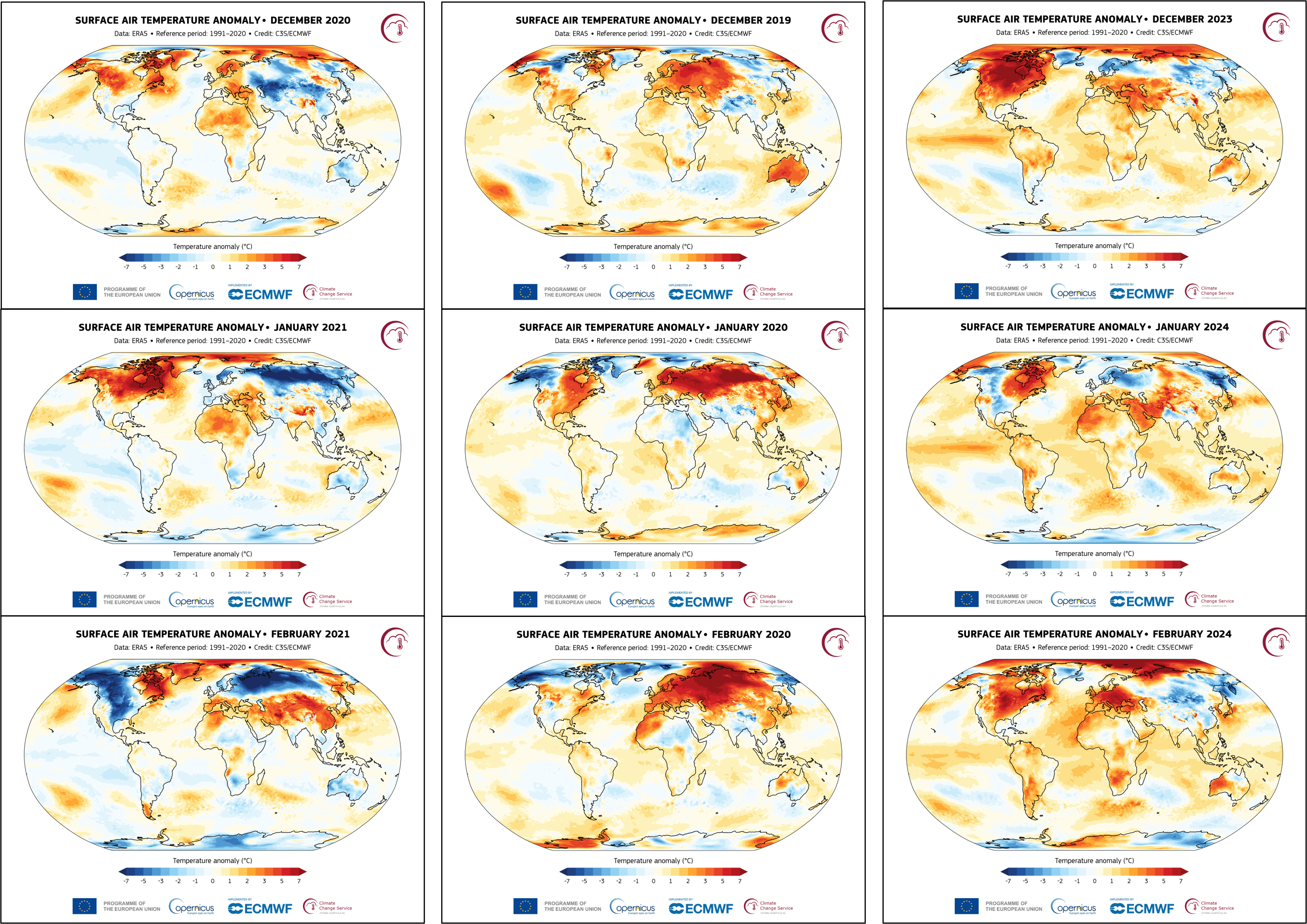
Fig. 8.2.4 Image exports of monthly surface air temperature anomaly for the 2020–2021 La Niña event (left), a typical year without ENSO activity (2019–2020; centre), and the 2023–2024 El Niño event (right).#
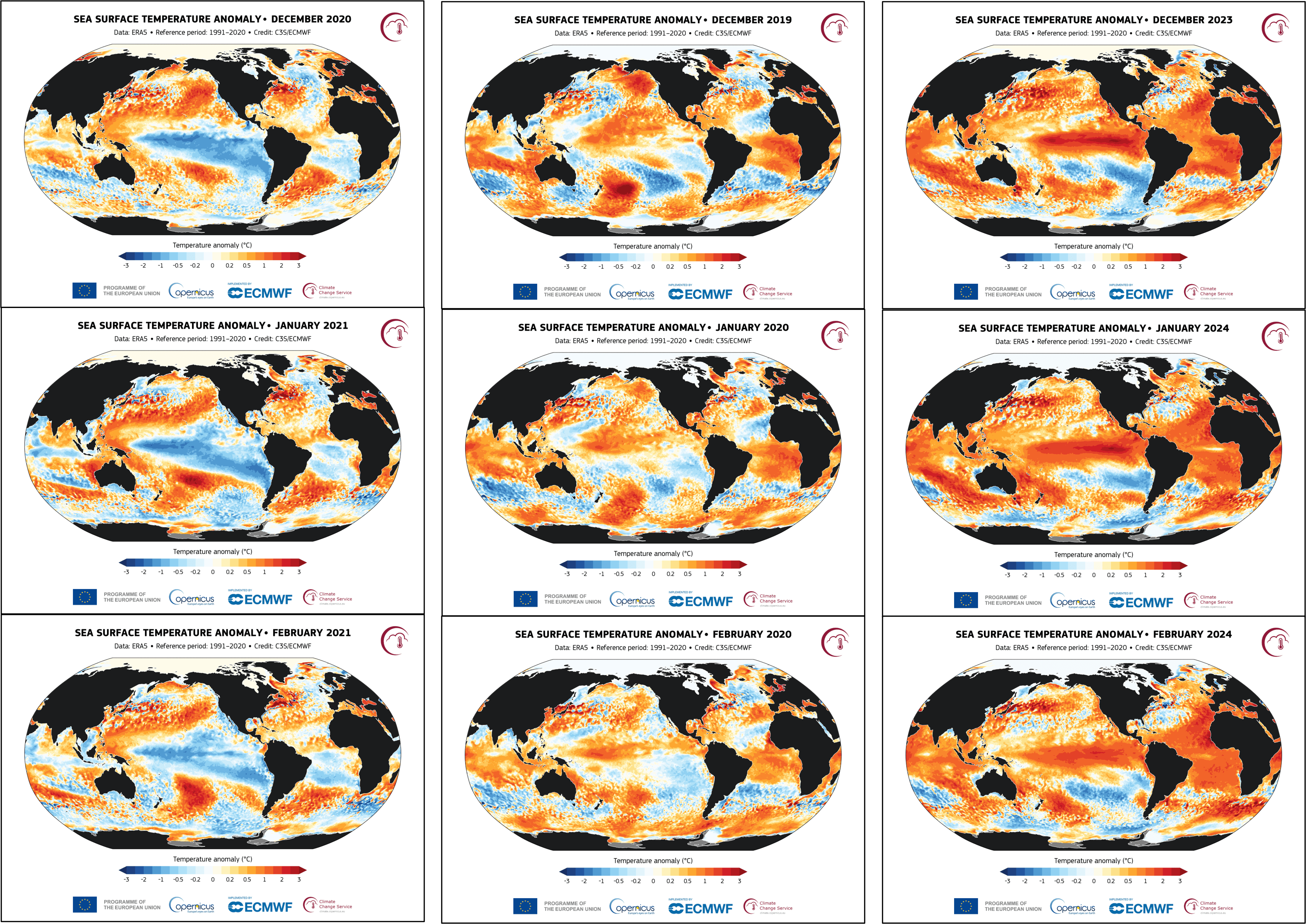
Fig. 8.2.5 Image exports of monthly sea surface temperature anomaly for the 2020–2021 La Niña event (left), a typical year without ENSO activity (2019–2020; centre), and the 2023–2024 El Niño event (right).#
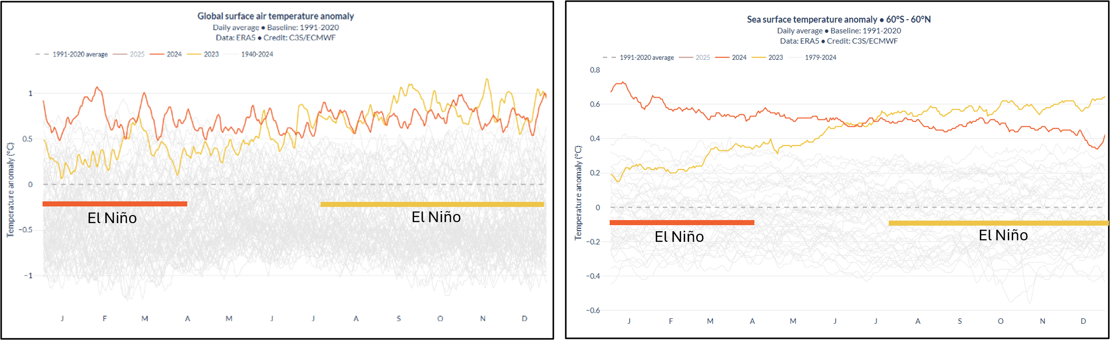
Fig. 8.2.6 Screenshot of the Pulse dashboard showing global surface air and sea surface temperature anomalies for 2023 and 2024. The thick coloured lines marked El Niño have been added in this assessment to show when the events occurred; colours correspond to the year.#
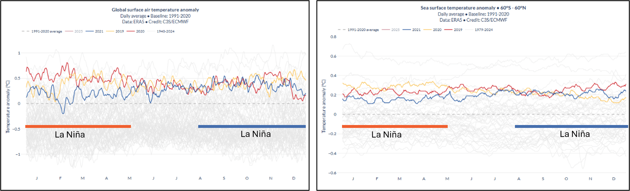
Fig. 8.2.7 Screenshot of the Pulse dashboard showing global surface air and sea surface temperature anomalies for 2019, 2020, and 2021. The thick coloured lines marked La Niña have been added in this assessment to show when the events occurred; colours correspond to the year.#
2. Heatwaves#
Introduction#
There is no universal definition of a heatwave, with different organisations and countries having established their own criteria; however, we can generally define them as a period of time, from a few days up to a few weeks, of temperatures significantly higher than the normal range for that location at that time of year [Lhotka+22, Stefanon+12]. For example, the European State of the Climate 2023 used the definition “a period of at least three consecutive days when both the daily surface air temperature minima and maxima are higher than the highest 5% of values for the day in question during the 1991–2020 reference period”.
One of the main impacts of heatwaves is the danger they pose to human health. According to the World Health Organisation, roughly 489 000 heat-related deaths occur each year, and high-intensity heatwave events are known to increase mortality rates. For example, in Europe alone, in the summer of 2022, an estimated 61 672 heat-related excess deaths occurred [Ballester+23]. Due to these impacts, heatwaves often generate significant news coverage. The June 2024 Eastern Mediterranean heatwave led to real-time reporting of its increasing death toll, as well as journalistic investigations into the overall impact and the drivers of this extreme event [Bali+24, World Weather Attribution+24].
Assessment of Pulse#
Pulse is determined to be moderately suitable for visualising the temperature impacts of heatwaves, depending on the date and extent of the heatwave, for the following reasons:
Variables: Pulse allows for the visualisation of temperature anomalies against WMO’s standard reference period, and significant regional warming anomalies are the key indicator of heatwaves.
Data Granularity: Pulse’s daily maps have anomalies on a scale from \(-\)12 °C to \(+\)12 °C, with approximately 1 °C increments for surface air temperature. This is in line with the temperature anomalies experienced during a heatwave, with regional anomalies usually being around 3 to 8 °C of warming (for Europe) [Ma+20].
Spatial Coverage and Resolution: Pulse uses a 0.25° \(\times\) 0.25° grid, which is suitable for showing regional, national, and multi-country heatwave events. While exported maps are global by default, one can manually zoom in on the globe and take screenshots at different scales. The global time series is unsuitable for visualising heatwaves as they are regional, not global events.
Temporal Coverage and Resolution: Daily air temperature anomaly maps, matching the typical duration of heatwaves, are available in Pulse from 1 January 2023 onwards. Before this date, only monthly and annual maps are available, limiting the usefulness of the application for visualising short historical heatwaves, which may be smoothed out and hence not visible over these time frames.
Timeliness: The near real-time updates of Pulse, typically 2 days behind, allow for timely visualisation of the heatwaves currently taking place, supporting near-real-time weather monitoring and communication.
Uncertainty: Pulse does not show uncertainty estimates in the time series or maps. The ERA5 dataset has an uncertainty of around 0.5 °C. This is suitable for the use case of visualising heatwave events, which cause significantly larger temperature anomalies.
Example: Southeastern Europe June 2024 Heatwave#
Between 3 and 27 June 2024, several countries in Southeastern Europe and part of the Middle East were affected by a heatwave, with the most extreme temperatures occurring between 11 and 14 June [Dafis+24]. Figure 8.2.8 shows the image exports from Pulse; these are global maps that are useful to show where large-scale events are occurring, but less useful for interpreting regional and national effects. Figure 8.2.8 also displays the June 2024 average, where the heatwave event is visible due to its extended duration. This visibility typically occurs only with longer heatwaves, not shorter ones. In Figure 8.2.9, the region of interest has been magnified, making details in the location of the temperature anomalies more visible. These magnified anomaly maps are more useful for visualising heatwave events with the Pulse application, but the image exports are still suitable.
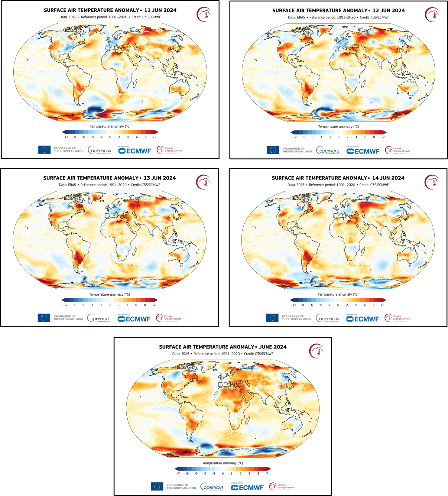
Fig. 8.2.8 Image exports of the global surface air temperature anomaly over the 11 to 14 June 2024 peak heatwave period (top and middle) and averaged over June 2024 (bottom).#
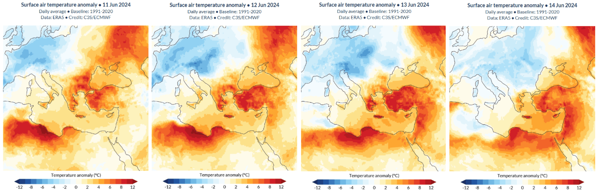
Fig. 8.2.9 Magnified regions of interest of the global surface air temperature anomaly over the 11 to 14 June 2024 peak heatwave period. Note: these are screenshots of the Pulse dashboard.#
3. Volcanic Eruptions#
Introduction#
A volcanic eruption is a sudden release of gas, ash, rock fragments, and/or molten lava through a vent onto the Earth’s surface and/or into the atmosphere. Beyond their dramatic local impacts, large volcanic eruptions can influence global climate through the injection of sulfur dioxide (SO2) into the stratosphere, the second major layer of Earth’s atmosphere – above the troposphere – extending from approximately 11 to 50 km in altitude. Once in the stratosphere, sulfur gases oxidise into sulfate aerosols, which reflect incoming solar radiation [Cole-Dai+10].
In the short term, volcanic eruptions can disrupt local tropospheric conditions, typically over a few days. These effects include a reduction in the diurnal temperature cycle, with cooling in the day due to reduced solar radiation and warming in the night from trapped infrared radiation. The magnitude of this effect depends on the size and location of the eruption, but can be around 15 °C [Robock+00]. On a global scale, the long-term impact of stratospheric volcanic eruptions is tropospheric cooling, usually up to around 0.5 °C, lasting from a few months up to two years, again dependent on the nature and scale of the eruption [Robock+00].
Conversely, the immediate stratospheric response to a volcanic eruption is localised heating. This results from the absorption of infrared solar radiation at the top of the stratospheric layer and terrestrial radiation at its base, following the injection of aerosols. However, this effect only lasts a few weeks, depending on the eruption magnitude and atmospheric circulation patterns, as the aerosols will mix through the stratosphere globally [Robock+13]. Large eruptions may cause stratospheric temperature increases of a few degrees [Boretti+24, Robock+00]. While the global signal is one of net surface cooling and net stratospheric heating, the regional climate response to volcanic eruptions can be more complex.
Volcanic eruptions are widely reported in the media due to their immediate and often severe impacts on local populations. However, media coverage also frequently highlights the broader implications of such events, including their effects on global surface temperatures and the insights they offer into climate processes and what can be learnt from volcanic eruptions for potential geoengineering strategies [King+24].
Assessment of Pulse#
Pulse is determined not to be suitable for visualising the temperature impacts of volcanic eruptions, for the following reasons:
Vertical resolution: Pulse only displays air temperature 2 m above the surface. Many of the effects of major volcanic eruptions take place in the stratosphere; these are not captured by near-surface temperature data.
Confounding factors: Pulse uses a 1991–2020 baseline for the calculation of temperature anomalies, a period that includes warming from climate change. When analysing historical volcanic eruptions like Pinatubo (1991), this reference period dampens or distorts the apparent magnitude of cooling following the eruption. A baseline more representative of conditions at the time would more accurately reflect the cooling effect of an eruption, although it may be difficult to disentangle from other year-on-year differences such as ENSO events.
Temporal resolution: The annual and monthly maps in Pulse cannot visualise the immediate, local surface air temperature impact of an eruption effectively, since the local effects only last a few days and are thus washed out in longer-term maps. However, with Pulse now providing daily maps from January 2023, any major future volcanic eruptions should prompt an assessment of its suitability for visualising the associated localised, short-term surface cooling effects. The same is true for the sensitivity of the underpinning ERA5 dataset to the near-surface temperature impacts of sudden events like volcanic eruptions.
Example: Mount Pinatubo (June 1991)#
The volcanic eruption of Mount Pinatubo in the Philippines occurred on 15 June 1991, releasing approximately 15 million tons of SO2 into the stratosphere [Boretti+24], forming a global layer of aerosols in weeks. These aerosols reflected incoming solar radiation, reducing global surface temperatures by an average of about 0.4 °C during 1992–1993 [Boretti+24], making it one of the most notable short-term climate impacts of a volcanic eruption in the 20th century. The aerosol layer gradually dissipated over the following three years [Minnis+93]. There is no information available on the localised short-term effects of the eruption; however, due to the temporal availability of the data (monthly), the short-term effects would not be visible in Pulse.
Figure 8.2.10 shows lower global average temperatures for 1992 and 1993 compared with 1991. These years are known to have experienced cooling influenced by the volcanic eruption; however, further analysis is needed to distinguish the impact of the eruption from other contributing factors, such as ENSO events. Therefore, it is not possible to directly identify the temperature impact of the volcanic eruption based solely on Figure 8.2.10.
Fig. 8.2.10 Screenshot of the Pulse dashboard showing global average surface air temperature anomalies for 1990–1993. Mount Pinatubo erupted in June 1991.#
Example: 2022 Hunga Tonga–Hunga Haʻapai eruption#
On 15 January 2022, the Hunga Tonga–Hunga Haʻapai volcano erupted explosively after weeks of activity, injecting volcanic gases and materials into the stratosphere and generating atmospheric shock waves and tsunami waves across multiple ocean basins. Unlike the Mount Pinatubo eruption, the Hunga eruption led to a cooling of global stratospheric temperatures by 0.5 to 1.0 °C from 2022 to mid-2023 due to the injection of large amounts of water vapour and minimal sulfur dioxide [Randel+24]. While this excess water vapour is believed to have contributed to global warming through enhanced radiative forcing, its precise impact remains uncertain due to the influence of other factors like ongoing climate change and ENSO events [Gupta+25]. Whether the eruption caused surface temperature warming or cooling is still being debated in the scientific literature [Gupta+25, Jenkins+23].
Localised monthly maps (Figure 8.2.11) do not show any surface air temperature effect of the eruption, as the local effects are very short-term; daily or higher spatial resolution maps would be required to visualise such an effect. Figure 8.2.12 shows the global average surface air temperature time series. Any potential warming or cooling effects of the eruption cannot be disentangled from the other contributing factors to global temperatures, such as ENSO events. Hence, overall Pulse is not suitable for visualising the air temperature impacts of this event.
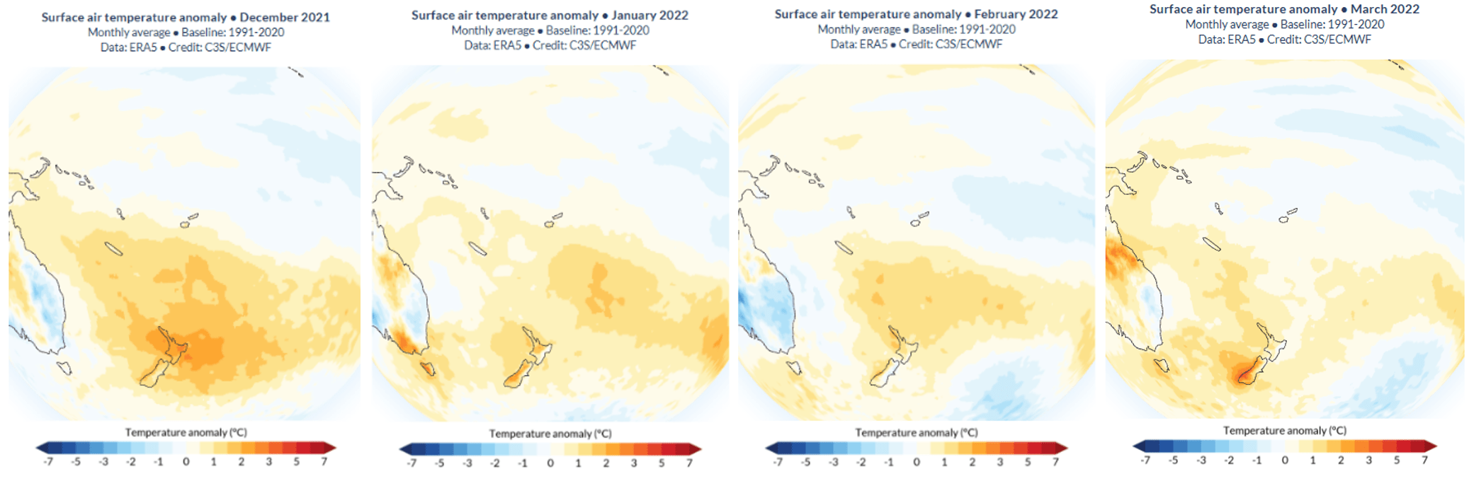
Fig. 8.2.11 Magnified region of interest of the global surface air temperature anomaly for the months before (December 2021), during (January 2022), and after (February and March 2022) the eruption. Note: these are screenshots of the Pulse dashboard.#
Fig. 8.2.12 Screenshot of the Pulse dashboard of average surface air temperature anomaly, for 2021: the year before the eruption for comparison, 2022: the year of the eruption, 2023: the year after the eruption.#
ℹ️ If you want to know more#
Key resources#
More about the ERA5 reanalysis:
More about temperature anomalies:
More about ENSO:
More about heatwaves:
Thermal Trace application for visualising feels-like temperatures
More about volcanic eruptions:
References#
[AFP+24] AFP, ‘February marks 9th straight month of record-smashing global heat’, Times of Malta, Mar. 07, 2024. Accessed: May 14, 2026. [Online]. Available: https://timesofmalta.com/article/february-marks-9th-straight-month-recordsmashing-global-heat.1087990
[Bali+24] K. Bali, ‘Heat wave in Greece claims more tourist lives’, DW, Jun. 26, 2024. Accessed: May 14, 2026. [Online]. Available: https://www.dw.com/en/fatal-heat-wave-sweeps-greece-claims-more-lives/a-69485803
[Ballester+23] J. Ballester et al., ‘Heat-related mortality in Europe during the summer of 2022’, Nature Medicine, vol. 29, no. 7, pp. 1857–1866, Jul. 2023, doi: 10.1038/s41591-023-02419-z.
[Bell+18] J. E. Bell et al., ‘Changes in extreme events and the potential impacts on human health’, Journal of the Air & Waste Management Association, vol. 68, no. 4, pp. 265–287, Apr. 2018, doi: 10.1080/10962247.2017.1401017.
[Boretti+24] A. Boretti, ‘Reassessing the cooling that followed the 1991 volcanic eruption of Mt. Pinatubo’, Journal of Atmospheric and Solar-Terrestrial Physics, vol. 256, p. 106187, Mar. 2024, doi: 10.1016/j.jastp.2024.106187.
[Cole-Dai+10] J. Cole‐Dai, ‘Volcanoes and climate’, WIREs Climate Change, vol. 1, no. 6, pp. 824–839, Nov. 2010, doi: 10.1002/wcc.76.
[Dafis+24] S. Dafis and D. Faranda, ‘The June 2024 Eastern Mediterranean Heatwave likely exacerbated by human-driven Climate Change and Natural Variability’, 2024, doi: 10.5281/zenodo.14103941.
[Gerretsen+23] I. Gerretsen, ‘The high cost of an El Niño in 2023’, BBC, Jun. 08, 2023. Accessed: May 14, 2026. [Online]. Available: https://www.bbc.co.uk/future/article/20230525-what-will-an-el-nino-in-2023-mean-for-you
[Gupta+25] A. K. Gupta, T. Mittal, K. E. Fauria, R. Bennartz, and J. F. Kok, ‘The January 2022 Hunga eruption cooled the southern hemisphere in 2022 and 2023’, Communications Earth & Environment, vol. 6, no. 1, p. 240, Mar. 2025, doi: 10.1038/s43247-025-02181-9.
[Hersbach+20] H. Hersbach et al., ‘The ERA5 global reanalysis’, Quarterly Journal of the Royal Meteorological Society, vol. 146, no. 730, pp. 1999–2049, Jul. 2020, doi: 10.1002/qj.3803.
[Jenkins+23] S. Jenkins, C. Smith, M. Allen, and R. Grainger, ‘Tonga eruption increases chance of temporary surface temperature anomaly above 1.5 °C’, Nature Climate Change, vol. 13, no. 2, pp. 127–129, Feb. 2023, doi: 10.1038/s41558-022-01568-2.
[Johnson+20] S. Johnson, ‘La Niña forms off Australia’s coast sparking warnings of dangerous weather and cyclones - here’s how the weather pattern will affect your city’, Mail Online, Sep. 29, 2020. Accessed: Jun. 16, 2025. [Online]. Available: https://www.dailymail.co.uk/news/article-8784073/How-La-Nina-weather-event-decade-bring-wet-summer.html
[King+24] S. King, ‘Conspiracy theories swirl about geo-engineering, but could it help save the planet?’, BBC, Jul. 21, 2024. Accessed: Jun. 16, 2025. [Online]. Available: https://www.bbc.co.uk/news/articles/c98qp79gj4no
[Kundzewicz+16] Z. W. Kundzewicz, ‘Extreme Weather Events and their Consequences’, Papers on Global Change IGBP, vol. 23, no. 1, pp. 59–69, Jan. 2016, doi: 10.1515/igbp-2016-0005.
[Li+22] X. Li, Z. Hu, Y. Tseng, Y. Liu, and P. Liang, ‘A Historical Perspective of the La Niña Event in 2020/2021’, JGR Atmospheres, vol. 127, no. 7, p. e2021JD035546, Apr. 2022, doi: 10.1029/2021JD035546.
[Lhotka+22] O. Lhotka and J. Kyselý, ‘The 2021 European Heat Wave in the Context of Past Major Heat Waves’, Earth and Space Science, vol. 9, no. 11, p. e2022EA002567, Nov. 2022, doi: 10.1029/2022EA002567.
[Ma+20] F. Ma, X. Yuan, Y. Jiao, and P. Ji, ‘Unprecedented Europe Heat in June–July 2019: Risk in the Historical and Future Context’, Geophysical Research Letters, vol. 47, no. 11, p. e2020GL087809, Jun. 2020, doi: 10.1029/2020GL087809.
[McGrath+20] M. McGrath, ‘“Moderate to strong” La Niña weather event develops in the Pacific’, Oct. 29, 2020. [Online]. Available: https://www.bbc.co.uk/news/science-environment-54725970
[McPhaden+06] M. J. McPhaden, S. E. Zebiak, and M. H. Glantz, ‘ENSO as an Integrating Concept in Earth Science’, Science, vol. 314, no. 5806, pp. 1740–1745, Dec. 2006, doi: 10.1126/science.1132588.
[Mefo Newuh+24] M. Mefo Newuh, ‘El Nino climate pattern intensifies in East Africa’, DW, Apr. 26, 2024. Accessed: Jul. 07, 2025. [Online]. Available: https://www.dw.com/en/el-nino-climate-pattern-intensifies-in-east-africa/a-68932184
[Minnis+93] P. Minnis et al., ‘Radiative Climate Forcing by the Mount Pinatubo Eruption’, Science, vol. 259, no. 5100, pp. 1411–1415, Mar. 1993, doi: 10.1126/science.259.5100.1411.
[NOAA+24] NOAA, ‘What are El Niño and La Niña?’, National Ocean Service. Accessed: Jun. 11, 2025. [Online]. Available: https://oceanservice.noaa.gov/facts/ninonina.html
[Philander+85] S. G. H. Philander, ‘El Niño and La Niña’, Journal of the Atmospheric Sciences, vol. 42, no. 23, pp. 2652–2662, Dec. 1985, doi: 10.1175/1520-0469(1985)042<2652:ENALN>2.0.CO;2.
[Randel+24] W. J. Randel, X. Wang, J. Starr, R. R. Garcia, and D. Kinnison, ‘Long‐Term Temperature Impacts of the Hunga Volcanic Eruption in the Stratosphere and Above’, Geophysical Research Letters, vol. 51, no. 21, p. e2024GL111500, Nov. 2024, doi: 10.1029/2024GL111500.
[Robock+00] A. Robock, ‘Volcanic eruptions and climate’, Reviews of Geophysics, vol. 38, no. 2, pp. 191–219, May 2000, doi: 10.1029/1998RG000054.
[Robock+13] A. Robock, ‘The Latest on Volcanic Eruptions and Climate’, EoS Transactions, vol. 94, no. 35, pp. 305–306, Aug. 2013, doi: 10.1002/2013EO350001.
[Rowlatt+23] J. Rowlatt, ‘Excessive heat: Why this summer has been so hot’, BBC, Jul. 13, 2023. Accessed: Jun. 16, 2025. [Online]. Available: https://www.bbc.co.uk/news/science-environment-66143682
[Shen+23] M.-H. Shen and J.-Y. Yu, ‘Changes in El Niño characteristics and air–sea feedback mechanisms under progressive global warming’, Terrestrial, Atmospheric and Oceanic Sciences, vol. 34, no. 1, p. 19, Dec. 2023, doi: 10.1007/s44195-023-00051-5.
[Shi+23] L. Shi, R. Ding, S. Hu, X. Li, and J. Li, ‘Extratropical impacts on the 2020–2023 Triple-Dip La Niña event’, Atmospheric Research, vol. 294, p. 106937, Oct. 2023, doi: 10.1016/j.atmosres.2023.106937.
[Stefanon+12] M. Stefanon, F. D’Andrea, and P. Drobinski, ‘Heatwave classification over Europe and the Mediterranean region’, Environmental Research Letters, vol. 7, no. 1, p. 014023, Mar. 2012, doi: 10.1088/1748-9326/7/1/014023.
[Wang+16] C. Wang, C. Deser, J.-Y. Yu, P. DiNezio, and A. Clement, ‘El Niño and Southern Oscillation (ENSO): A Review’, in Coral Reefs of the Eastern Tropical Pacific, vol. 8, P. W. Glynn, D. P. Manzello, and I. C. Enochs, Eds., in Coral Reefs of the World, vol. 8., Dordrecht: Springer Netherlands, 2017, pp. 85–106. doi: 10.1007/978-94-017-7499-4_4.
[WMO+23] World Meteorological Organization (WMO), ‘World Meteorological Organization declares onset of El Niño conditions’, World Meteorological Organization. Accessed: Jun. 16, 2025. [Online]. Available: https://wmo.int/news/media-centre/world-meteorological-organization-declares-onset-of-el-nino-conditions
[WMO+24] World Meteorological Organization (WMO), ‘El Niño is forecast to swing to La Niña later this year’, World Meteorological Organization. Accessed: Jun. 16, 2025. [Online]. Available: https://wmo.int/news/media-centre/el-nino-forecast-swing-la-nina-later-year
[World Weather Attribution+24] World Weather Attribution, ‘Deadly Mediterranean heatwave would not have occurred without human induced climate change’, World Weather Attribution, Jul. 31, 2024. Accessed: Jun. 16, 2025. [Online]. Available: https://www.worldweatherattribution.org/deadly-mediterranean-heatwave-would-not-have-occurred-without-human-induced-climate-change/